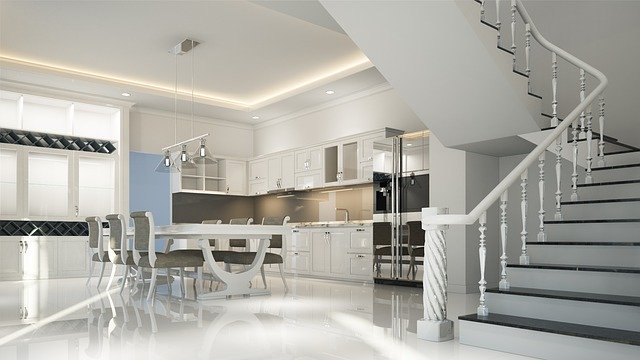
A well-designed and appropriately decorated room demonstrates the basic elements of interior design, horizontal and vertical lines. Good design in all styles, traditional, neo-classic, modern or contemporary is confirmation to the interior design world that those simple elements are represented.
The two foundations of design are vertical and horizontal lines. If used correctly, these design elements position the focus in a room for the best visual balance. They are the design features that provide the essential support for the room design and serve to accent a specific interior space. More important than focal points, a design without properly used horizontal and vertical elements is a failed design.
For example, crown moulding on the ceiling is a strong horizontal element. The horizontal line takes your eyes around the perimeter of the room. This is why all home stagers emphasize the mouldings in homes that they prepare for resale. Commonly used vertical elements in interiors are floor lamps, lamps on tables, hutches and armoires, indoor plants, pedestals, and hanging chandeliers. In hotels, indoor fountains and water features provide vertical height. These vertical design elements direct the eye upward and emphasize the overall height of the space.
Article Source: http://EzineArticles.com/1876871


